

The truth about inflation
Is inflation always a monetary phenomenon, as Milton Friedman once claimed? Or are there other reasons for the rise in prices? Blair Fix shows that anyone who thinks so simply overlooks the power effects of the price war. Inflation is a power struggle over who can raise prices the fastest.
 Reading time 31 minutes
Milton Friedman has been dead for more than a decade, but his thoughts still linger. In the 1960s , Friedman once explained that inflation is always and everywhere a monetary phenomenon — a problem of too much money supply. Since then, whenever inflation rises, you can be sure that someone will repeat Friedman's old dictum and accuse the state of printing too much money.
If it just could be that easy. Like much in economic theory, Friedman's dictum seems plausible at first glance. Inflation represents a general increase in prices. And since prices are nothing more than the exchange of money, more money circulating means prices must rise. Consequently, inflation is “always and everywhere a monetary phenomenon”.
However, Friedman's dictum does not stand up to closer scrutiny. The problem is that inflation is understood as a steady increase in prices. This is theoretically convenient, but empirically wrong. In the real world, inflation varies widely. While the price of apples increases by 5%, the price of cars can increase by 50% and the price of clothes can decrease by 20%.
To understand how inflation actually works, we must not rely on economics textbooks but look at real data. That's what political scientist Jonathan Nitzan did during his doctoral research in the early 1990s. His work culminated in a dissertation entitled » Inflation As Restructuring «. In the real world, Nitzan noted, price action is always "differential," meaning there are winners and losers. It follows that inflation is not a purely "monetary phenomenon" as Milton Friedman claimed. Inflation restructures the social order.
Today, as inflation fears return and Friedman's dictum is revived , let's stick to the real facts.
The money supply theory
Let's start with Milton Friedman's “ Money Supply Theory ”, which states that inflation is always caused by printing too much money. 1 Like so much of neoclassical economic theory, this theory is a mixture of two components:
- Questionable assumptions about human behavior;
- An accounting equation that makes the theory look good.
The power of this combination was substantiated by Friedman's famous “ F-Twist ,” in which he argued that the assumptions of a theory are irrelevant. All that matters, Friedman claimed, is that the theory makes accurate predictions.
Friedman's "F-Twist" invalidates dubious assumptions. But there is still the problem of accurate predictions. How do you ensure that your own theory always leads to the desired result? Here the neoclassical economists have developed a clever trick: they formulate their theory in the form of an accounting equation. Since the equation is true by definition, any "test" of the theory will be in your favour.
An old trick
Before we delve into Friedman's theory of inflation, let's look at some other uses of this trick. When neoclassical economists test their theory of income (the theory of marginal productivity), they invoke an accounting equation . They relate two different forms of income (usually sales and wages ) and then refer to one of the two as "productivity". Since they always find a correlation , their income theory is always "confirmed". Fine!
Then there is the neoclassical theory of economic growth. This theory posits that economic output is determined by a production function that calculates how the input of capital, labor and "technical progress" is converted into economic output. And guess what – this approach seems to be overwhelmingly true. However , the problem pointed out by Anwar Shaikh is that the production function is in reality a tautology . The production function "works" because by definition it is true. Nice!
Milton's money
Back to Milton Friedman's theory of inflation. Like a good neoclassical economist, Friedman bases his theory on an equation—one that relates the money supply M to the average price level P :
M•V=P•T
In this equation, V is the "velocity of money" - the speed at which money changes hands. And T is an index of the "real value" of all transactions.
The beauty of this equation is that it is true by definition. So if you base an inflation theory on it, the "predictions" will always be consistent. The problem that critics point out, however, is that this equation says nothing about the causes. It could be that printing too much money drives up prices. But it could also be that people are forced to borrow (and thus “create”) more money from banks due to rising prices.
When equations lead astray
A more subtle problem with this equation is that it is more misleading than real knowledge. The equation tells us something about the average price level, P . Economists then assume that this average is a useful measure of price behavior. But is that true?
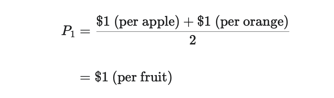
Here's an example of how things can go wrong if you follow the equation uncritically. Consider a company that sells two commodities, apples and oranges. If the two commodities are sold in equal shares, the price index P is the arithmetical average of the prices of the two fruits. If each fruit costs $1, then the price index is equal to:
Suppose that after a few months the price of apples increases by 50% while the price of oranges decreases by 50%. This change represents a drastic restructuring of the price system - a combination of hyperinflation and hyperdeflation. But this instability is not captured in our price index. The average price level remains unchanged:
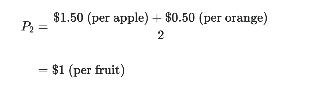
Just because the average price is unchanged does not mean that individual prices are stable. If prices develop differently, the notion of an "average price level" is meaningless, if not misleading.
The problem with averages
In the hands of economists, the idea of an “average price level” is, to quote Joan Robinson, “a powerful miseducation tool”. 2
The problem is that averages are part of an equation - which by definition is true. I can calculate the average of any conceivable set of numbers. But that doesn't mean that my calculation will be meaningful. This is because average values indicate a trend, but say nothing about whether this trend is actually present.
Here's an example. Let's say two people have an average net worth of $100 billion. Is this already a strong trend? Maybe - if the two people are Warren Buffet (net worth $104 billion) and Mukesh Ambani (net worth $96 billion). Both have approximately the same wealth. But what if the two people are Jeff Bezos ($200 billion net worth) and I ($0 billion net worth)? In this case, the average misleads more than real knowledge.
Of course, scientists are aware of this problem. Therefore, they are trained to provide average values along with a measure of variation. In this way you get a feeling for the meaningfulness of the calculated average value.
The most common measure of variation is the “ standard deviation ”, which measures the average deviation from the mean. 3 Coming back to my wealth example, reporting the standard deviation of wealth tells you when the average is measuring a genuine strong trend and when it isn't.
For example, Warren Buffet and Mukesh Ambani have an average net worth of $100 billion, with a net worth standard deviation of $5.7 billion. The fact that the variance is small (about 0.06 times the average) suggests that there is a real trend. In contrast, Jeff Bezos and I have an average net worth of $100 billion with a standard deviation of $141 billion. This huge deviation (1.4 times the average) suggests that there isn't a strong bias in the raw data. The average is therefore not meaningful.
Stated average values, unspecified deviations
The idea that mean values should be given along with a variance value is a fundamental part of empirical research. And yet, when economists study inflation, this practice is conspicuously absent. Why?
Perhaps economists have good reason not to report inflation swings. To consider this possibility, let's look at how economists measure inflation. At the beginning there is a so-called “price basket”. This is a bundle of goods whose prices are compared over time. For example, the consumer price index captures a basket of goods that are typically purchased by consumers. The wholesale price index , on the other hand, captures a basket of wholesale goods. There are many different types of shopping carts, but here I will focus on the Consumer Price Index (CPI).
After economists define a basket, they track the basket's average price. If you read the literature, you will see that economists have different formulas to give some commodities more weight than others when calculating average prices. The math looks fancy but doesn't change the fact that the output is some sort of "average". Be careful, though, because economists won't call it "average." They will call it a " price index ".
With their price index in hand, economists then assess the inflation rate by seeing how quickly the index rises over time. As an example, Figure 1 shows the percentage change in the US CPI since January 1, 2020. During this period, the index increased by 7%. Inflation!

After looking at the price index development, the causes and consequences of inflation are then discussed. For example, here is a comment from the New York Times:
Consumer prices rose at their fastest rate in more than three decades in October as fuel costs rose, supply chains remained strained and rents rose -- worrying news for Federal Reserve policymakers and the Biden White House.
Given the trend in Figure 1, such a comment seems justified. And yet one crucial piece of information is missing. I have shown you the development of the average price. But I didn't tell you about the variation of price changes.
It is left to the reader to draw their own conclusions about how inflation varies by commodity. Given this lack of information, most people will assume that the evolution of the average price indicates a strong central trend. In other words, they assume that inflation is uniform. And they might be right about that.
Inflation, like gravity
Perhaps economists have a good reason for not specifying the deviations in price developments. Perhaps this variation is so small that it is not worth recording. In this case, inflation is like Earth's gravity: remarkably smooth.
In high school physics, I did hundreds of calculations on projectile motion. For each task, we assumed that the gravitational acceleration was a uniform 9.81 m/s2. I vaguely remember my teacher mentioning that this acceleration varies slightly depending on where you are in the world. But we never included these deviations in our calculations. It wasn't even mentioned in my textbooks. Did the physicists hide something from me?
To consider this possibility, I went to the International Bureau of Gravimetry (I love that name) and downloaded data on Earth's gravity fluctuations. As with anything in science, there are a number of ways to estimate Earth's "gravity anomalies" (the differences in the acceleration of gravity across the Earth's surface). But for the purposes of school physics, the different methods are irrelevant. No matter how you look at it, geographic differences in Earth's gravity are incredibly small.
In the data I downloaded, the standard deviation of Earth's gravity anomaly is about 40,000 times smaller than the (average) textbook acceleration of 9.81 m/s2. So unless you're running an incredibly sensitive experiment, the fluctuations in gravity are so small that you can ignore them. 4
Perhaps economists don't report price changes because, like gravitational fluctuations, they are vanishingly small. To consider this possibility, let's return to the evolution of the US CPI - a measure of the average price level. Let's assume that, in addition to this price index, we would record the price development of all goods included in the consumer price index basket. If inflation were mostly uniform, the outcome might look like Figure 2.

In Figure 2, the colored lines show the indexed prices of each commodity. I want to emphasize that this is simulated data. The actual data (which we will see shortly) looks very different. The point of this simulation is to show you what it would look like if inflation were mostly flat.
In the period shown, the official consumer price index rose by 7.2%. In my simulation, inflation is so smooth that the standard deviation of price change for all commodities is 0.15%. At only 2% of the average, this deviation is so small that we can ignore it.
So perhaps economists know that inflation varies slightly between commodities, but they also know that the variation is so small that it is unreportable.
inflation in the real world
Now that we've shown you what price action would look like if inflation were mostly flat, let's look at inflation in the real world. She is very different.
Figure 3 shows the price changes for all goods included in the consumer price index. Rather than clustering closely around the average price level (the "official CPI"), real goods have a mind of their own. Their prices move in all sorts of directions—often in ways that seem unrelated to how the average price moves.

Notice how showing the price change of all CPI goods changes the inflation story. Looking at Figure 3, one would not conclude that all prices are increasing evenly. However, looking only at the consumer price index, this conclusion seems plausible.
If we examine the full spectrum of price changes, we see that inflation is a messy affair. The numbers show us that. Since January 1, 2020, the consumer price index has increased by 7.3%. This value seems significant - until we measure the volatility of price changes. Over the same period, the standard deviation of price change was 10.7%. So, the fluctuation of the price changes was about 1.5 times larger than the average price changes. 5
To put these fluctuations in perspective, let's return to our wealth example. Jeff Bezos and I have an average net worth of $100 billion. However, this value does not indicate a real trend. Jeff Bezos is worth $200 billion. I'm worth 0 billion dollars. We can find that the average is misleading when we measure the standard deviation of our wealth, which is $141 billion. So the fluctuation of our wealth is about 1.4 times the average.
This 1.4 ratio, you'll notice, is lower than the 1.5 ratio we found for the price changes. So if we conclude that comparing my fortune to Jeff Bezos' is pretty much meaningless, we should also conclude that CPI performance is pretty meaningless. Both averages mislead more than they inform.
A History of Inflation Fluctuations
The real story of inflation - which is largely unreported - is the wildly divergent price changes across commodity groups. Figure 4 shows how this inflation has evolved across the 12 major commodity groups covered by the US CPI.

Let's take a closer look at the analysis. First, I tracked the price changes for each commodity in the US CPI basket (in each geographic location) between January 2020 and October 2021. Then I categorized these commodities into major groups (as classified by the Bureau of Labor Statistics). Finally, I show the price changes within the individual commodity groups using boxplots.
This disaggregated analysis paints a completely different picture than the evolution of the average price. It can be seen that inflation varies greatly between the individual product groups. Some groups, such as 'Menswear', have seen little (if any) inflation. For other groups, such as "private transport", there were massive price increases. Figure 4 also shows that inflation varies widely within each commodity group. Inflation and deflation often go hand in hand - a fact made clear when the boxes cross the dashed red line.
So the real inflation story, which goes largely untalked about, is that price changes have been remarkably uneven. In fact, it is so inconsistent that reporting the change in average price is almost meaningless. So why are price changes not reported?
Perhaps we can forgive newspapers for not printing charts like Figures 3 and 4. Admittedly, these charts are more difficult to interpret than simply showing the percentage change in a price index. However, this difficulty does not absolve economists of their responsibility. Any trained economist should know how to interpret the type of evidence shown above. And yet it is unlikely to find a nuanced analysis of inflation even in the specialized literature. Why actually?
Is it different this time?
Before we chastise economists for not reporting price changes, we should give them a leap of faith. Perhaps inflation is usually smooth, but current circumstances are unusual. It could be that the pandemic has thrown an otherwise stable pricing system into chaos. In that case, if we look at the deeper history of inflation, we should see an even pattern with all prices moving together.
To examine this possibility, let's look at the long-term path of US inflation. We'll start with the default image shown in Figure 5. I measured the inflation rate using the annual change in the consumer price index. The red lines show the threshold for double-digit price changes - an arbitrary but commonly cited threshold for "big" inflation.

I could write a book about the ebb and flow of inflation shown in Figure 5. But I won't do that, because there are many such books. Instead, I'm interested in what's not in this picture, which is price fluctuations.
Perhaps economists ignore price swings because, while large today, they were negligible in the past. That would make our current situation what economists call a "distortion" - an event that has thrown prices out of "balance". In less “distorted” times, price action should be even.
To see if this is the case, let's look at the long-term trend in price changes in the US. Figure 6 shows the data. I start by plotting the average inflation rate (blue line). Then I add some much-needed information - the range of price changes for all CPI goods. This is the blue area that shows the 95% range for the annual price change for all goods covered by the CPI (all locations). The range of price changes is – quite large.

Figure 6 shows that our current situation is not unusual. Since CPI data began in 1913, the average inflation rate in the US has been 2.8%. However, over the same period, the standard deviation of the annual price change averaged 5.2%. So, historically, the inflation swing has been about 1.8 times larger than the inflation average. As a reminder, the difference between Jeff Bezos' net worth and mine was just 1.4 times our average net worth. So looking at the average US inflation rate is even less meaningful than comparing Jeff Bezos' wealth to my own.
To sum up, the data is pretty clear: historically, it was common for price fluctuations to outpace the average rate of inflation. So why are these fluctuations not shown?
An unspecified pattern in the unspecified data
Before we turn on the science police, let's give the economists one last chance to redeem themselves. While it certainly seems doubtful that price changes are rarely reported, perhaps we can think of a good reason to reassure ourselves about that.
The only reason I can think of is that the price changes, while large, are otherwise consistent. If price change fluctuations are constant over time, then perhaps we can ignore them when measuring average price movement.
To consider this possibility, let's imagine a counterfactual situation in the US, where the fluctuations in price change over time are constant. In this US, the annual change in price varies by commodity, but this change is constant from year to year. It is set to the average range of variation in the real US.
The red lines in Figure 7 show what this counterfactual US would look like. We see that the range of price changes does not fluctuate. Instead, it has a constant "width". (The red lines are a constant distance apart.) We also see that this counterfactual USA is quite different from the real world.

Our counterfactual thought experiment shows that price fluctuations (blue shaded area) are not constant in the real world. At times, this variation has been far greater than the historical average (seen in Figure 7 when the blue-shaded area falls outside the red lines). This was the case during the stagflation crisis of the 1970s and during the inflationary spurts of the two world wars. However, sometimes the price changes have been much smaller than the historical average (shown in Figure 7 when the blue-shaded area is within the red lines). This was the case in the roaring 20's and the boom years of the 1960's.
Given these observations, it seems we have a problem. The fluctuations in the price changes are large, but are not displayed. Also, the price change itself varies over time. So we have an undetected pattern in the unspecified data. This is bad. It means that economists have overlooked an important aspect of inflation.
But it gets worse.
Had economists bothered to measure and report the fluctuations in price change, they would have discovered an interesting correlation. The price change fluctuations rise and fall with the average inflation rate.
Figure 8 shows the trend. On the horizontal axis I have plotted the annual change in the consumer price index - a measure of inflation. On the vertical axis I have plotted the variability in the annual price change of all CPI goods as measured by the standard deviation. The red line shows the smoothed trend, which is in the shape of a U. The data suggest that the faster prices change, on average, the more inflation fluctuates.

What we see in Figure 8 is a manifestation of Jonathan Nitzan's discovery: inflation restructures the price system. This quality makes inflation socially traumatic.
An insignificant thing?
In the 19th century, political economist John Stuart Mill famously declared that money was of little interest:
In short, there can be no more insignificant thing in the economy of society than money.
John Stuart Mill, 1871
While I've always thought this claim dubious, it's easy to imagine a world where it would be true. Imagine a world where inflation is completely uniform. All prices (including wages) rise and fall together. In this world Mill's dictum applies: price changes are meaningless. Today an apple costs $1, tomorrow it doubles to $2. But since the price of everything else doubles as well (including your income), nothing changes. Inflation is an “insignificant thing”.
Unfortunately (for Mill's dictum) the real world works differently. In it, inflation is never equal, but always different. And that makes them extremely important. Inflation restructures the social order, creating winners and losers. This restructuring, Jonathan Nitzan recognized, is the most important aspect of inflation. And yet it is this property that is almost entirely ignored by economists.
But it works in theory...
For some reason, economists didn't listen to the memo that was given to all other scientists -- the memo that said you should report an average alongside a measure of variation. So why the bad education? Is it an accident? Or is it intentional?
Sadly, I think it's the latter. Economists ignore the reference to fluctuations because their concept of inflation assumes that price changes are smooth. It's like the old joke. An economist says to a physicist:
Sure, this equation works in practice. But does it work in theory?
Applied to inflation, the joke is:
Sure, inflation differs greatly in practice. But does it also differ greatly in theory?
The answer is overwhelmingly no. In economic theory, inflation is assumed to be uniform. But why should economists assume something that differs so much from reality?
In my opinion, this is how it works. I consider the "does it work in theory" joke to be a litmus test of ideology. It's a test to see if someone creates ideas over evidence. The more this is the case, the less it is about science and the more about spreading ideology. Applying this litmus test to mainstream economics reveals that it is a secular priesthood masquerading as science.
The monetarist monastery
An example of this priesthood is monetarism - the school of thought propagated by Milton Friedman. According to monetarists, most social ills are caused by government printing/spending too much money. Not surprisingly, monetarists believe these problems have a simple solution: government austerity.
Back to inflation. With prices soaring, most monetarists are quick to call for the government to tighten its belt. Your logic works like this:
Inflation is linked to the money supply via the formula:
- Inflation is linked to the money supply by the formula M • V = P • T (where M is the money supply and P is the average price level);
- The government controls the money supply;
- The state has to spend less money.
Like most good ideologies, this argument contains a sneaky trick. The monetarists conceal that the money supply only gives a meaningful insight into inflation if price changes are smooth. If price changes vary widely by commodity (as they do in the real world), then the evolution of the average price tells little (if anything) about the evolution of individual prices. And that means that the money supply says little (if anything) about real inflation.
Faced with this problem, the monetarists' solution is to make their ideas work “in theory”. Suppose inflation is uniform. call for austerity measures. Repeat that.
Solow's snake oil
Although popular in the late 20th century, monetarism has always been a controversial part of neoclassical economics. Many "moderate" economists considered monetarism to be quackery. Hence Robert Solow's famous dig at Milton Friedman. “Everything,” Solow quipped , “reminds Milton of the money supply. Well, everything reminds me of sex, but I keep it out of the paper.
Monetarist taunts aside, Robert Solow and his macroeconomic colleagues had their own brand of snake oil. So Solow's famous paper describing his model of economic growth began with this bang:
There is only one commodity, production as a whole... So we can clearly speak of the real income of the community.
Robert Solow, 1956
The “one-goods” assumption is derided in heaps among critics. And rightly so. But I think we should give Solow credit for following it up with a wise insight. If "real income" is to be clear, we must be able to treat society as if it were only producing a commodity.
What Solow is suggesting (but not acknowledging) here is a serious problem in macroeconomics. Macroeconomics is based on the principle that the monetary value of output Y can be divided into two components – “real output” Q and the nominal price level P :
Y = Q • P
If there is only one commodity, then Q is unique. (Hence Solow's remark.) But the formula also works when there are several (unchanging) goods whose prices move together. In this case , P is an inflation index that uniquely describes the evolution of all prices.
The problem for Solow and his macroeconomics colleagues is that none of these assumptions hold true in the real world. Existing societies produce many goods whose prices do not change evenly. And that creates a problem. It means that the production quantity, Q , is hopelessly ambiguous. (See this paper for a detailed discussion. )
Like monetarists, macroeconomists solve the problem by making their ideas work “in theory”. They simply define inflation as a uniform change in prices, and then assume that "real income" is unambiguous. Procrustes would be proud.
Why differential inflation matters
After seeing how price changes vary widely across commodities, you may be wondering why this matters. Well, it's important because it means that inflation is not a purely "monetary" phenomenon. Inflation redistributes income.
Since his PhD in the 1990s, Jonathan Nitzan (along with Shimshon Bichler) has published some insightful research on the distributional effects of inflation. Nitzan and Bichler, for example, found that inflation systematically benefits big business. Figure 9 shows the most recent version of their research.
Let's take a closer look. Let's start with "profit margin" - the amount of a company's profit relative to sales. Nitzan and Bichler then measure profit margin for two groups of companies:
- The 'Compustat 500' – the 500 largest US companies (ranked by capitalization) in the Compustat database;
- All US companies;
Next, Nitzan and Bichler take the ratio of these two profit margins. The resulting "differential mark-up" measures the relative profitability of large companies compared to the profitability of all US companies. Figure 9 shows that this differential markup rises and falls with the wholesale price index, a measure of inflation. In other words, inflation favors big business profits.

Notice how this evidence changes your view of inflation. It's hard to blame the government for the problem. Because when big business systematically profits from inflation, it means these big companies raise prices faster than anyone else. In other words, it is the oligopolies that drive inflation.
So it seems that inflation in the real world doesn't look like it does in economics textbooks. Yes, inflation is a "monetary phenomenon" - like everything to do with prices. But more importantly, inflation is a power struggle over who can raise prices the fastest.
This post also appeared in English on the Economics From the Top Down blog.
Thanks for writing to us